Story

Designed to Evolve: Adaptive Reuse and the Architecture of Endurance

As SOM marks 90 years, our Adaptive Reuse studio reflects on the challenge of preserving architectural legacy while designing for what comes next.

The most resilient buildings are those capable of changing gracefully.

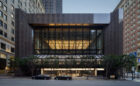
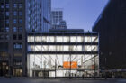
As SOM marks its 90th anniversary, the work of our Adaptive Reuse team offers a real-time study in architectural endurance. Often revisiting buildings designed by our firm decades earlier, the team addresses the friction between timeless form and shifting function. While a building design may endure the test of time, aging mechanical systems and evolving user needs can make renovation and retrofit projects all but inevitable. 

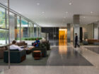
Designing for this shift is a distinct responsibility. And the ability to revisit and update our own designs allows us to act as responsible stewards, honoring the original intent while ushering in the elements that maintain relevance for future generations. We’re seeing formerly siloed offices becoming vibrant, social ecosystems. Once-private towers are opening their street-level plazas and gardens to the public. And many mid-century modern buildings—designed with clear structural and planning logic—are proving capable of accommodating new programming without compromising the original architectural identity. This work makes a strong case that preserving legacy and pursuing innovation can be one and the same. 

On the occasion of Preservation Month, members of our Adaptive Reuse studio reflect on projects that define our legacy and are being reimagined to serve their users for decades to come.


United States Air Force Academy – Polaris Hall

Colorado Springs, Colorado
Look closer with Principal and Adaptive Reuse Leader Frank Mahan, AIA

© Magda Biernat Photography

Why it resonates
The entirety of the U.S. Air Force Academy was designed at one time by SOM and completed in 1958. It has an incredible architectural consistency—it is like a modernist version of a collegiate gothic college campus. The scale and drama of the place is unlike anything else I’ve ever seen. The Academy asked us to design an iconic new building for this carefully considered composition. We incorporated a skylight structure that creates a counterpoint to the historic chapel, but most of the usable space of the building is actually adaptive reuse of preexisting spaces.

Its evolution
The Academy is a beautiful composition of iconic midcentury architecture, but it continues to evolve. The Academy is an active university and military base and must continue to change to meet the evolving needs of those uses. Despite its rigid-appearing architecture—or maybe because of it—people feel a strong connection to it and are motivated to ensure it thrives long into the future. Sometimes this means carefully inserting a new building. Sometimes this means upgrading systems for sustainability. And sometimes this means expanding elsewhere on the campus.

Saving places
The relationship between the architecture and the landscape at the Academy is carefully calibrated—the buildings gain their power from this relationship and their contrast to nature. This relationship must be preserved, even as the Academy continues to evolve and build.

Final thought
The project integrates architecture and structure seamlessly. SOM was responsible for both, and I think it’s impossible to say where one starts and the other ends.


345 Montgomery

San Francisco, California
Look closer with Associate Principal and Adaptive Reuse Leader Lisa Follman

© David Wakely Photography

On why it resonates
The ground plane has a real civic weight in San Francisco’s fabric. It’s open, legible, and visually continuous with the interior public spaces of the fantastically detailed tower lobby and the pavilion-style banking hall. This is what drew me to this site for my thesis project on adaptive reuse over 20 years ago, long before we revisited the project!

On its evolution
In 2016, we had the opportunity to reinvent the banking hall. The interior volume was reconfigured into a grand central atrium with communicating stair and tiered seating beneath the banking hall’s signature coffered ceiling, visible from inside and out. Originally designed for a singular banking use, the project can now support a broader civic role. The banking hall has already transitioned to a cultural use, and is well suited for future institutional or academic occupancy.

What’s overlooked
People often focus on the tower and miss the ground plane. To me, the project is really about the composition of the plaza, lobby, and banking hall as a connected civic sequence. The banking hall, in particular, is not ancillary—it’s the centerpiece.


One Maritime Plaza

San Francisco, California
Look closer with Senior Computational Design Architect Matt Turlock

Dave Burk © SOM

What resonates
I recall first seeing One Maritime Plaza (formerly the Alcoa Building) during an early visit to the Embarcadero, well before my time at SOM. Its bold exterior X-braces were unmistakable, essentially wearing its structural logic on its sleeve. Now home to SOM’s San Francisco studio, I appreciate how that external framework yields such an expansive, column-free interior space. Coming to SOM with roots in both architecture and structural engineering, this building resonates deeply with me. It really captures the finesse of blending the two disciplines.

Fun fact
I love that you can read the site’s history just by looking at how the building meets the ground. When it was designed, the Embarcadero Freeway’s ramps completely dominated the street level, so the pedestrian experience was deliberately lifted above the traffic. Today, that translates into a raised park sitting atop the base parking garage, linked to the Embarcadero Center by pedestrian bridges. Even though the 1989 Loma Prieta earthquake ultimately led to the freeway’s demolition, that elevated pedestrian world still remains as a fascinating echo of the city’s past.

Saving places
If someone were to change the building today, I’d definitely fight to save the diagonal braces—they are the core of the project’s identity. The building was actually retrofitted in the early 2000s with additional horizontal beams to strengthen it for a Maximum Considered Earthquake. Even though it’s unlikely the exterior structure will see another major change, the poetic geometry of that original X-brace pattern is something that should always be remembered and protected.


Gas Company Tower

Los Angeles, California
Look closer with Consulting Partner Keith Boswell, FAIA

Dave Burk © SOM

On aging gracefully
The site slopes 55 feet to zero from corner to diagonal corner, and the tower confidently meets the pedestrian level on all sides. The materials, details, and interfaces of systems look as crisp and modern today as opening day in mid-1992, 34 years young.

Often overlooked
The top of the tower evokes the shape and color of a gas flame. For years, Gas Company was the only high-rise in downtown Los Angeles without a sign plastered on the top. It didn’t need it. The building was the client’s mark on the skyline.

In the details
The lobby limestone composition is an element that looks simple but took real effort. The proportions of the stone just work right. In specialties areas such as the public stairs at the hand rails, the limestone is sculpted. The joinery between stone is three-eighths of an inch everywhere and is open jointed, so there is no grout or sealants. All of this took a lot of effort from the architectural team members to achieve consistency in the design and details.

On its impact
Legacy by definition is “anything handed down from the past.” Gas Company Tower is designed, detailed, and executed in a modern language that has stood the test of time. Our work must address the client’s requirements and needs and be able to evolve as clients evolve. Gas Company Tower has evolved and  achieved that—so far.


Wells Fargo Center

Los Angeles, California
Look closer with Design Architect James Diewald, AIA

Dave Burk© SOM

On timelessness
Timeless is a word I have always grappled with as an architect, but is an appropriate descriptor for the Wells Fargo Center. Even 40 years later, the building’s geometric rigor and massing distinguish it within the downtown Los Angeles skyline. While the red granite curtain wall is a hallmark of the 1980s, the crispness and extreme flatness of the enclosure still feel contemporary.

On change

In our 90-year history, we’ve learned that the most resilient buildings are those capable of changing gracefully. In 1983, corporate landscapes were often designed as formal, protective buffers. Today, they are softer and more user-centric. The 2016 renovation transformed the lobby and plaza from spaces you simply move through into destination spaces where you reconnect with nature and the city throughout the workday. We’ve seen a massive shift in how public space functions. Now, it’s a social hub.

My goal for the future is adaptive stewardship—evolution that respects legacy while embracing progress.

Look closer
The glass on the west side of the north lobby is a feat of invisible engineering. To prioritize total transparency between the lobby and the plaza, we utilized a unique, concealed capture system at the base and top of each light. The glass looks effortless and disappears within the frame, but the structural work required to hide those connections was significant.


Lever House

New York City, New York
Look closer with Associate Principal Amy Garlock

Lever House
Lucas Blair Simpson © SOM

Looking back
This building established corporate modernism in America and created the office district on Park Avenue that we know today. The building also established SOM’s reputation as a designer of office space for the corporations of the postwar economic boom, and in that way, set the template for so many of the projects we work on today. The building is a great example of how the lessons of International Style modernism were adapted to the office building, from the transparent lobby with a planter that breaks the line between interior and exterior to the way that materials are expressed in their pure form. The purity of the diagram and the materials actually made the restoration process more challenging, because there is nothing decorative to hide behind.

Vantage point
The diagram of the building sets up the unique nature of the interior spaces in that the way the tower relates to Park Avenue creates dynamic views to the north and south. The tower’s thinness and transparency generate the still-desirable office space, and I think there is not enough acknowledgement of the way that the building is still a radical proposal in New York City.

Behind the scenes
For the preservation of the murano glass mosaic wall at the elevator lobby, we had to move an adjacent wall to be able to reuse and recompose the tile to fill in sections that had been damaged or altered over time, since no contemporary material could adequately match the historic tile. The restoration contractor meticulously relocated and patched the tile, and the result looks seamless!

Rethinking the office today
Lever House set a new standard for how public space can be integrated into a building in a dense urban environment, and the plaza is still well used today—a place to take a small break from the city and integrate art and architecture. We can use its template to think about new ways to rethink the relationship of the office lobby to the public and how interior and exterior relate at the ground floor of a building.


510 Fifth Avenue Renovation and Adaptive Reuse

New York City, New York
Look closer with Principal and Adaptive Reuse Leader Frank Mahan, AIA

© Eduard Hueber | Arch Photo Inc

In contrast
This project is one of SOM’s crown jewels from its midcentury heyday. It is boutique in scale, but can be compared and contrasted directly with Lever House, which preceded it by only two years. We can clearly see what Gordon Bunshaft learned at Lever House and how he evolved the glass curtain wall for this project. It’s a little pavilion that fully integrates art and industrial design in a way that was both bespoke to its original purpose but also well-suited to adaptation.

Fun fact
The project was originally designed as the first transparent bank building. Before this building, banks were always heavy and solid to connote safety and security. Instead, here the bank vault itself was put on display through a transparent glass curtain wall. The bank vault door was designed by industrial designer Henry Dreyfuss and compared to “a beautiful brooch” in articles about the building. Harry Bertoia also created two site specific art installations for the building: a 70-foot-long, 16-foot-high metallic screen and a hanging mobile. Both were retained and restored on site as part of the building’s adaptive reuse.

Look up
The luminous ceiling is one of the most noteworthy features. It’s highly visible from the exterior, and the resultant high light levels on the interior contribute to the building’s incredible transparency. The original ceiling was composed of asbestos-containing translucent panels lit by cold cathode tubing above. We not only replaced both the panels and light sources, but also reconfigured the dividing bands to incorporate new ventilation, fire sprinklers, and retail spot-lighting. The simple and uniform appearance actually incorporates many different technical requirements.


9 West 57th Street

New York City, New York
Look closer with Project Manager Van Kluytenaar

Lucas Blair Simpson © SOM

On adaptation
The recent renovation transformed the building from a corporate fortress into a hospitality-driven campus. By transforming the 27th floor into a full-service amenity hub, the renovation democratized the building’s legendary views, allowing tenants to use the tower more like a private social club than a traditional office. Simultaneously, the new cellar-level fitness center—reimagined with a ground-floor skylight—integrates wellness directly into the workday, turning cellar storage space into a light-filled sanctuary. This shift pairs the ancient permanence of the travertine lobby with a modern, high-touch lifestyle, setting a new standard for the New York workplace.

What’s different
This project resonates with me because it suggests that true power doesn’t need to be flashy. While other buildings use gold leaf or neon, 9 West 57th Street relies on the weight and history of stone. Standing in the lobby, you are surrounded by the same material that defined the Roman Empire, yet you are in the heart of the world’s most modern financial capital. It’s a quiet, confident kind of luxury that feels permanent in a city that is constantly changing.

Have a peek
Sheldon Solow was one of the world’s most prolific art collectors. He used the ground floor behind the travertine walls to house the Solow Art and Architecture Foundation. For years, it contained masterpieces by Picasso, Matisse, and Botticelli, as well as a $100 million Giacometti sculpture. Because of the building’s glass storefront, you can often see these world-class masterpieces just by peeking through the glass from the sidewalk. The art in the lobby is a continuation of the gallery into the commercial office space.


875 North Michigan Avenue (formerly John Hancock Center)

Chicago, Illinois
Look closer with Studio Heads Giuliano Pairone and Kevin Rodenkirch, AIA LEED AP BD + C

Dave Burk © SOM

What resonates with Giuliano
It is quite unique to have the chance to work on one of the most important landmarks of the city—and one designed by SOM. In a way, we are going back to something we started decades ago and continuing to add to the original vision. It is a privilege to personally lead a project in such an iconic building. Expanding the experience of the current 94th floor observation deck to the 95th and 96th floors is a challenge, but an exciting one. The importance of the building, its location, and the unparalleled views of the lake and the city are a never-ending source of inspiration.

On tour with Kevin
Explaining how the exposed bracing on the exterior of the building is designed to resist the wind loads and keep the building upright is made interesting by the fact that this was the first high-rise to use this system and since then, countless other buildings have learned from it as they incorporated cross-bracing. I also like to tell the story of how the building was originally considered as two towers and due to site constraints they were combined to create the first truly mixed-use tower in the world, where again, ​countless other buildings have since learned from this building by incorporating mixed-use programs.

Giuliano on adaptation
The great thing about this building is that it evolves with time. It remains iconic, and its facade is timeless, but the building is flexible enough to respond to changing needs. The fact that we are now converting a restaurant space into a triple-height experiential space, offering a unique view of the lake and the city, is further proof of the efficiency of the original design and the new opportunities the building continues to offer.

Kevin on access
I think that the top of this tower was always considered a special space that was meant to be an opportunity for the public to engage with the city. One of the best parts of this project is that it is an attraction that invites the whole world to come experience the space and learn about the building, the City of Chicago, and the history of high-rise architecture. This must always be open to the public, our job is to make it so engaging that people want to experience it for themselves. Fortunately, the business model for an observation deck will probably prevent this from ever changing.


Inland Steel Building

Chicago, Illinois
Look closer with Principal Lucas Tryggestad

Where past meets the future
What resonates most with me is the opportunity to bridge the gap between Inland Steel’s architectural legacy and its future in Chicago. The challenge of blending and updating the public space to harmonize with the building’s historic stature while ensuring they serve a modern purpose is compelling. From a technical perspective, it’s rewarding to rehabilitate and preserve the bones of the structure—specifically tackling the structural integrity and waterproofing that will sustain this landmark. Dissecting the original detailing is a rare window into the past that allows us to see where our craft has remained timeless and where we have progressed, ensuring our new interventions are both respectful and innovative.

Beyond the surface
Most people overlook the fact that a renovation of this caliber is as much a forensic investigation as it is a construction project. During the initial plaza demolition, we uncovered subsurface conditions behind the lobby wall that deviated from the original design documents, along with unforeseen deterioration that had been hidden for decades. Because the lobby’s visual continuity is so vital to the building’s landmark character, the hidden challenge was the critical timing required to analyze these anomalies in real-time. We had to swiftly develop remedial detailing that secured the facade’s integrity while ensuring the solution honored the original design intent, seamlessly integrating with the new plaza updates.


Netsch Residence

Chicago, Illinois
Look closer with Consulting Partner Brian Lee, FAIA

Dave Burk © SOM

Why it resonates
The design embodies former SOM design partner Walter Netsch’s geometric Field Theory, thoughts about domesticity for him and his wife, Dawn, and total integration with their art collection. I had visited the house and thought it was delightful. The home was later purchased by a couple who fell in love with the powerful original design concept, but wanted to adapt it to their lifestyle, while retaining as much essence of the house as possible. We took on this project, because I appreciated the history of the house, knew it had such good bones, and believed such a personalized house could be sensitively adapted by us.

On adaptation
We were very conscientious of the original design intent, details, and materiality but collaborated with the new owners on how to modernize the kitchen and baths with the same simplicity and logic of the house. They said, “Whatever we do here will be with Walter’s spirit in mind.” They are great stewards of the house.

Fun fact
The original design lacked any handrails, but it used furniture, planters, and art objects to keep people away from the edges. We knew we had to have new railings to do away with the feeling you would be stepping off a ledge at any time. In his oral history, when asked what he would do differently to the house, Walter speculated he would have a surface for dramatic lighting and projection. The new owners, while hanging many fewer paintings on the wall than the Netsches, commissioned the artists Luftwerks for a full, wall-sized digital art piece—I’m sure Walter would have been very pleased.

On endurance
Walter built the house with simple materials like exposed concrete block, face brick, and off-the-shelf windows. It was low-cost construction with a small footprint, but has a wonderful rich complexity and a dramatic uplifting atmosphere. I think it proved good design can create lasting, universal value.


More Stories