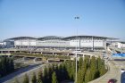
With its soaring, light-filled spaces, San Francisco’s International Terminal goes beyond the functional requirements of air travel to become something more: an iconic, uplifting gateway to the city. The terminal’s hangar-like structure and massive, double-cantilevered roof evoke the Bay Area landscape and the history of aviation itself. In this excerpt from a new book about the terminal, architect Craig Hartman tells the story behind the creation of a building that, nearly 20 years since its completion, continues to inspire.
The announcement of a massive expansion at San Francisco International Airport (SFO) in 1993 represented an extraordinary opportunity to rethink the nature of the airport. In the early 1990s, the City of San Francisco was in the midst of a deep recession which hit the real estate industry hard. The $2.4 billion expansion at SFO and its architectural centerpiece, a new International Terminal, was intended to make San Francisco America’s “Gateway to the Pacific” and act as a stimulus for the Bay Area’s design and construction industries. The project was imagined in the tradition of San Francisco’s bridges and Ferry Terminal — a civic landmark achieved as a public works program.
For SOM, the stakes were equally high. In the 1980s the firm had focused on the design of speculative office towers to the near exclusion of other building types. The commercial real estate crash in the early ’90s, coupled with the intellectual interests of a new generation of partners, was a powerful impetus for change in the firm’s practice. SOM needed to refocus on work that emphasized programmatic content including civic, social, cultural, and infrastructural needs and the integrated, interdisciplinary design innovation that work demands.
For those reasons, the International Terminal was timely. The project’s many challenges — the complexities of its technical systems, multiple passenger movement modes, its site constraints, its symbolic importance, and the potential for the union of structure and architectural form — provided an important step toward a renewed design ethos while redirecting and sharpening the focus of the firm’s West Coast practice.
From the beginning our intention was to make the terminal not only a highly resolved piece of the West Coast’s transportation infrastructure, but also a work of civic architecture that would resonate with San Francisco’s status as a Gateway to the Pacific. Its exterior form would have to convey itself clearly as a terminal for air travel, enclosing an interior space civic in scale whose simplicity and clarity, combined with the poetics of light and material, would result in a space befitting its Pacific Rim cultural setting.


The design proposed in the competition (and ultimately built) expressed these intentions through abstraction. Like an aircraft, the enclosing form was minimal and essential. Its aesthetics, I thought, should derive entirely from its function and the structural means of enclosing a vast interior space capable of handling millions of users annually. Long-term flexibility and highly constrained site conditions required long spans. The roof covering this singular space would therefore have to be the primary form-giver: a paired-wing, propped-cantilever anchored by a row of columns centered within the airport’s east-west entry boulevard median. On either side of the road there would be an additional row of columns which could not disrupt ground operations. Discussing these intentions and the proposed approach with Navin Amin, head of our structural engineering studio, quickly led to a far more elegant solution: a paired, double-cantilevered roof structure, which could be achieved by removing the center row of columns and balancing the two wings on two rows of five columns. This approach allowed us to create a balanced roof structure by pin-connecting the outboard wing trusses with five central, three-dimensional bowstring trusses. The length of the outboard-wing cantilevers was extended to balance their weight with that of the inboard wing cantilevers and central bowstring trusses, resulting in an extremely lightweight, long-span structure.
Structure and architectural form shape the user’s experience.
The terminal, as constructed, expresses the design intentions of our competition submission. After the selection, however, Louis Turpen, SFO’s director, entrusted us with a reexamination of the overall plan. This resulted in a critical reorganization of the airport’s road network, air train routing, BART connection, and the positioning of parking structures and other supporting facilities.
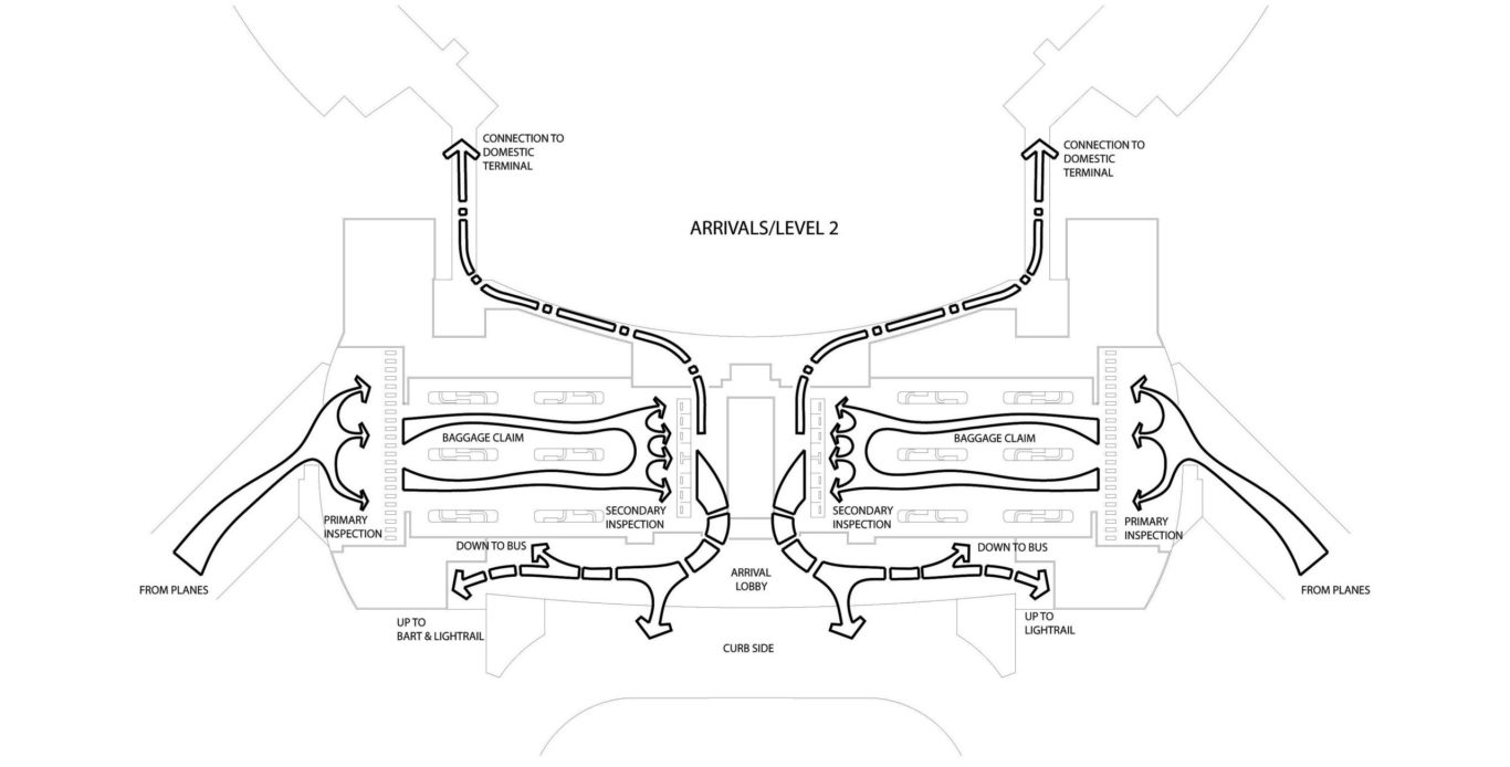
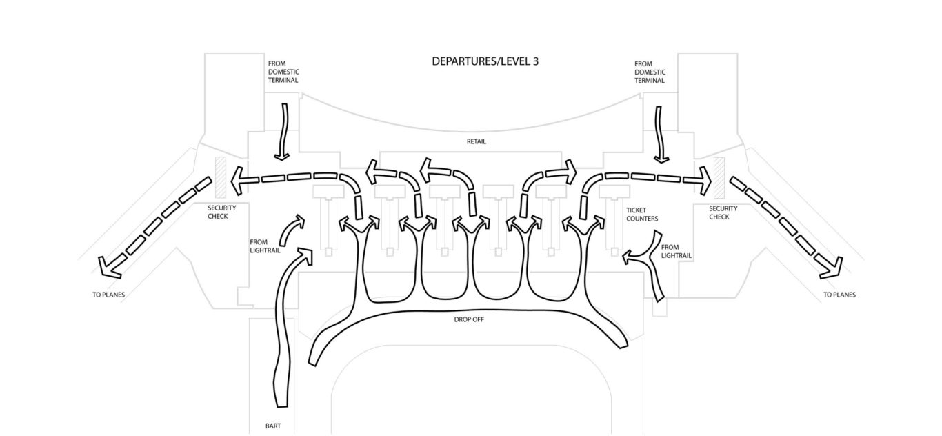
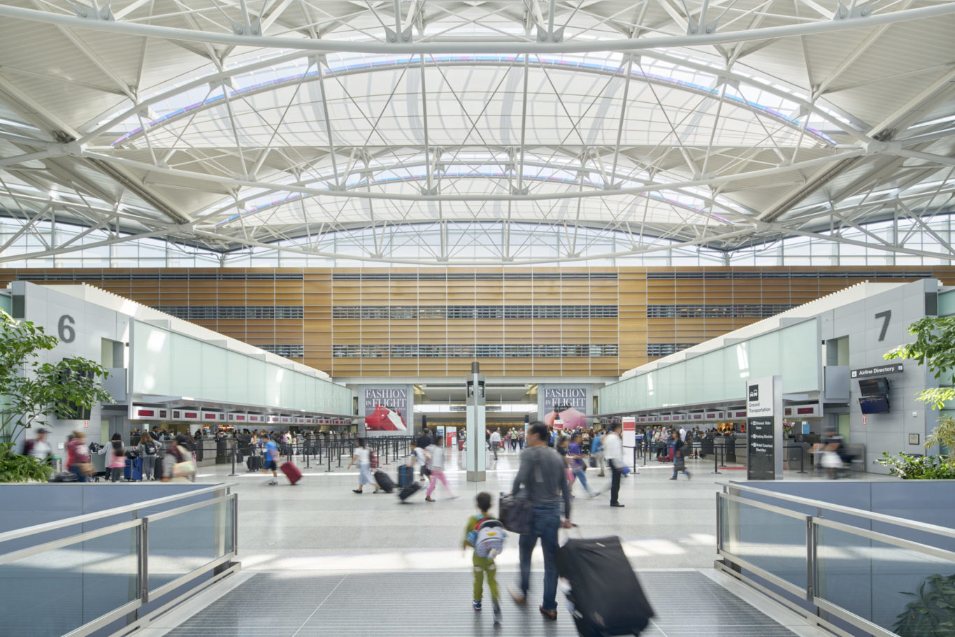
This reorganization extended to the terminal’s interior, including its inter-modal land and airside connections, its ticket counter concept, and passenger flow. The importance of this reexamination, inside and outside, cannot be overstated. We based the new interior and exterior plan on the principles of intuitive wayfinding in which all mobility systems, their connections, and movement between them, emphasized visual clarity. If users can see the points of access and visually understand the relationship between systems of mobility and destinations, the need for signage and language commonalities is diminished. Confusion and stress are reduced. These systems included cars, taxis, buses, regional and airport trains, aircraft, and foot traffic connecting them.
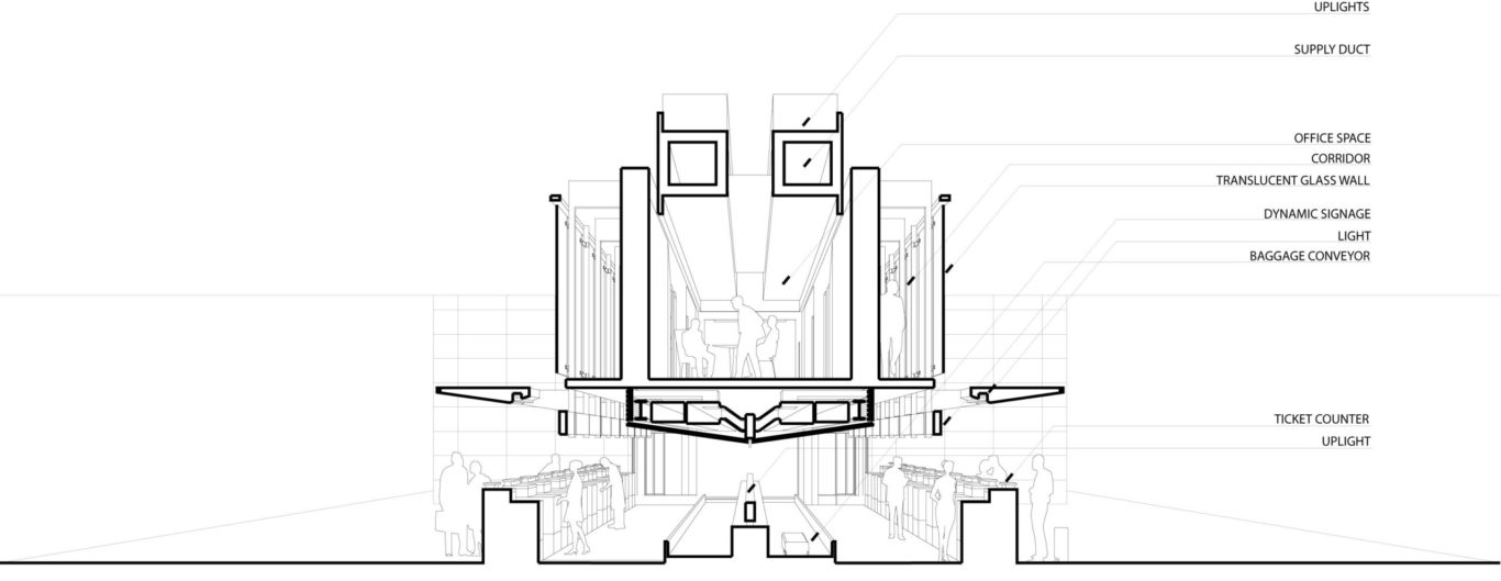
Equally important, inside the terminal we rearranged the departure hall ticket counters, creating five fingers parallel to passengers’ direction of travel, which made movement — from front door to counter to gate — simple and direct. This solution eliminated the unworkable ticket counter corrals in the original airport-generated concept plans, although it also eliminated most of the staff support zone directly behind the ticket counter required by the airlines. This loss was compensated by creating a thin bar of office space directly above the ticket counter for airline support staff, directly accessible to the counter zone by stair and accessible to a major multi-tenant office block directly above and behind the counters, extending the full length of the departure hall. This innovative arrangement allowed the airport to exercise its “common use” policy in which airline counters are not fixed territories per carrier. Rather, the counters occupied by each carrier can ebb and flow, based upon passenger volume.

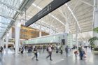
Structure and architectural form shape the user’s experience. Each facade and the roof are tuned to receive light specific to their orientation. The seven- hundred-foot-long west-facing main facade is protected by a forty-foot-tall light shield of aluminum sliced with thin horizontal bands of glass that admit diffuse light. Under the central bowstring truss, the aluminum shield is replaced by densely patterned ceramic frit glass that permits views into the departure hall. Above this shield, clear glass allows light to enter directly into the terminal’s truss zone.
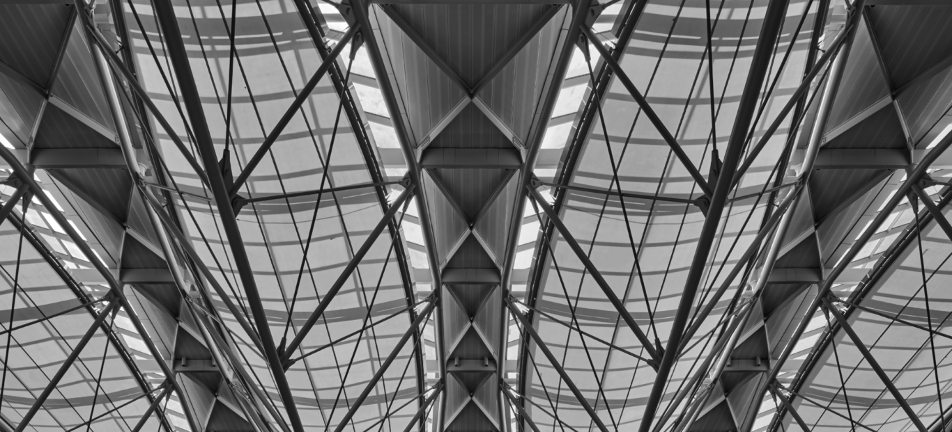
Adjusting the space to interact with light was a critical part of our work. The roof was conceived as an instrument of light. Its north and south cantilevered ends are trellises that reduce wind load and admit dappled light. Its double-cantilevered out-board wings are laced with thin bands of glass that track directly above the trusses. Light is reflected through the tubular top truss chord onto the adjacent ceiling surface. In the center, where the roof is carried by pin-connected, three-dimensional bowstring trusses, the skylights are open, forming elongated pointed ellipses. Here, artist and frequent collaborator James Carpenter inserted light-diffusing tensile sculptures that refract the incoming light and project the truss shadows onto the sculptures’ translucent faces, as well as onto the floor. During the evening, the main roof becomes an internal reflector. Lights atop each ticket-counter office structure focus their beams onto the main roof, illuminating the departure hall from within, creating a soft glow. The ticket counters have rear-lit translucent glass scrims that conceal the walkways cantilevered overhead. When lit, they punctuate the space like illuminated lanterns.
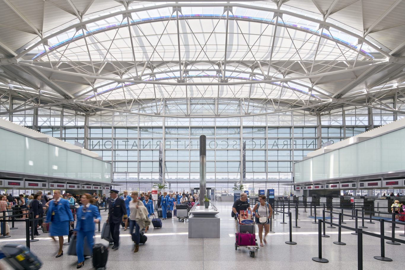
An often-heard reaction by users of the International Terminal is that there is a sense of dignity, calm, and pleasure that the building and its internal spaces brings to the experience of air travel. To the extent these elusive qualities were attained, it was due to a focus on the simple movement of passengers through the space, on clarity and light, and on eliminating the superfluous.
The full version of this essay appears in San Francisco International Airport — International Terminal, the third in a series of single-building monographs produced by SOM. Edited by Nicholas Adams, with a historical overview by William Littmann, the book contains an array of visuals—sketches, schematics, and renderings by SOM, and photography by Timothy Hursley and Bruce Damonte.
Find more information about the monograph series and other SOM books here.