Our research, exhibitions, and publications reveal stories about the future of design.
Ideas
SOM is a laboratory for new ways of practicing design, an engine for innovation.

Research + Innovation
For decades, SOM has invested in research that has transformed the architecture, engineering, and construction industry—from developing some of the earliest collaborative CAD platforms to devising the engineering solution for the world’s tallest building.
Whether partnering with universities, research laboratories, and private industry, or advancing our own independent projects, we seize the opportunity to pursue new ideas and applications for the sustainable buildings, cities, and communities of the future.
Stories
Every project holds more than meets the eye. Explore the stories behind our work, perspectives from our design leaders, highlights from our firm’s 85-year history, and more.

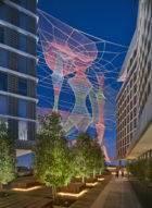
Exhibitions
Presented in partnership with museums and cultural venues around the world, an ongoing series of exhibitions pulls back the curtain on the design process—revealing the often unexpected results of collaboration.
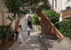
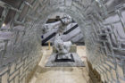
Exhibition
Angelus Novus Vault – Palazzo Mora, Venice
Publications
Explore our library of monographs, journals, and publications, where design ideas meet the printed page.
SOM Thinkers Series
Publication
SOM Thinkers: The Future of Transportation
SOM Thinkers
Publication
SOM Thinkers: The Future of the Skyscraper
SOM Thinkers
Publication
SOM Thinkers: The Future of Public Space
SOM Thinkers
01/
Launched to start a public conversation about the built environment, this series poses today’s most pressing questions about design. Each pocket-sized volume of SOM Thinkers brings together leading voices on the issues defining the future.